Warm White vs Cool White: Choosing the Colour of Light
Warm white and cool white describe the colour appearance of light, not how much light a bulb produces. Choose the colour alongside the materials in your room, then choose the output for the activity. We like to make that choice with the room's timber, textiles and evening atmosphere in mind.
Read Kelvin and lumens separately
Colour temperature is expressed in Kelvin, shown as K on a bulb specification. Lower values look warmer, with more yellow or amber in their appearance; higher values look cooler or more blue-white. Lumens describe light output. A warm-white bulb can have a high lumen rating, and a cool-white bulb can have a low one.
Colour names vary between products, so the number is a clearer way to compare. Our guide to choosing pendant lights puts this choice alongside shape, position and the light's role.
| Example | Appearance | What to consider |
|---|---|---|
| 2700K | A warmer-looking white | Evening atmosphere and how it sits with warm materials |
| 3000K | Still warm, a little less yellow than 2700K | Continuity with other warm-white lights |
| 4000K | A cooler, more neutral-looking white | The appearance of work areas and nearby rooms |
| 5000K and above | A cooler, daylight-like appearance | Whether that appearance suits the intended setting |
Why choose warm white or cool white?
Preference usually follows the room and the time of day. Warm white sits closer to the colour of late sun and firelight, so many people choose it for evenings, rest and conversation. Cool white looks crisper and more neutral, which some people prefer where they want surfaces and colours to read cleanly, such as a laundry, garage or workshop.
Neither is right everywhere. Outdoor floodlights and festive string lights come in both colours too, and the same Kelvin number tells you what to expect from each.
Warm white vs cool white in a living room
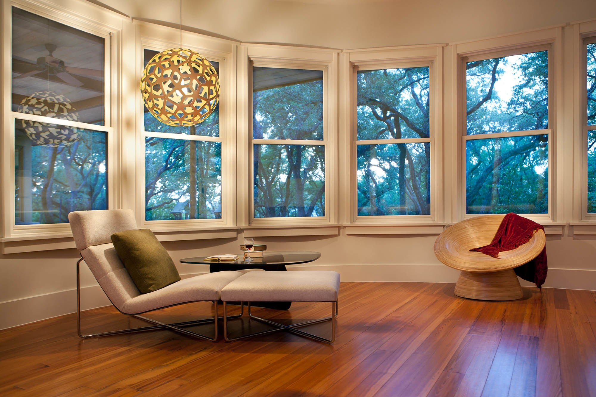
Begin with the atmosphere you want in the evening. Warm-looking light can sit comfortably with timber, textiles and a room used for gathering. Cool-looking light creates a different impression, so test it with the actual finishes rather than deciding from a colour chart alone.
Look at adjacent rooms too. A living room and kitchen may be visible together, even when they have different tasks. Choose their relationship deliberately. Our living-room pendant selection considers how the central fitting and smaller lights work around the seating.
2700K vs 3000K
Both are commonly used as warm-white choices. At comparable output and in the same setting, 2700K looks warmer than 3000K. The difference can be more noticeable when the sources are seen together than when they are in separate rooms.
Our Dusk portable lamp uses a 2700K source. If you plan to use it beside another lamp or a pendant, that specification gives you a concrete starting point for matching or intentionally varying the room's light.
Try the alternatives against paint, wood and fabric samples at home. Keep brightness comparable during the test. A brighter lamp may make the difference feel greater even though you are trying to compare colour alone.
That warm light sits within a story of place. Dusk was created with Pure Salt for the Tamatea Art Project; its four Sylvicta prints draw on the plants David encountered in Fiordland. A portion of its profits supports Pure Salt's conservation work in Tamatea.
Warm white vs daylight
'Daylight' is a product label for a cooler-looking light; it is not a promise to recreate the changing daylight through your window. Read the Kelvin specification rather than assuming all daylight-labelled bulbs look identical.
A cooler-looking source may be a deliberate choice in a particular work setting. It does not automatically put enough light on the task or solve glare. The position and output of the source still need to fit what you are doing.
Kitchens, dining and layered light
For food preparation, make sure the task surface receives appropriate light. For dining, consider faces, the table and the view into nearby spaces. These decisions involve direction, output and colour together.
Our ambient versus task lighting comparison helps separate those roles. A room can use several sources without each one trying to do everything. If a ceiling light feels harsh, use our brightness guide to distinguish colour from glare and excessive output.
Mixing warm and cool white
Lights that are seen together look most settled within a narrow range, such as 2700K and 3000K. A wider gap, for example warm white in a lounge and cool white in the adjoining kitchen, reads as a deliberate change. Decide where that change happens, at a doorway or between distinct zones, rather than letting it fall at random across an open room.
To find a light's colour temperature, look for the K figure on the bulb, its packaging or the fitting's specification. Where a product only says warm white, cool white or daylight, check its details for the Kelvin number before you buy.
Check the bulb before choosing
- Record the Kelvin ratings of lights you intend to keep.
- Decide which lights will be used together and seen together.
- Compare compatible bulbs with similar lumens but different colour temperatures.
- Test them after dark against the room's actual finishes.
- Keep the preferred bulb specification with the fitting's documents.
With an open shade, also compare clear and frosted finishes. Colour and shadow are different parts of the same room experience. Explore our pendant lighting for a form you enjoy in daylight as well as when illuminated.
These brightness and colour-temperature recommendations depend on your space; we offer free render visualisations using your exact room measurements to help you choose the pendant form.
Your questions
Is cool white brighter than warm white?
Not necessarily. Compare lumens for output and Kelvin for colour appearance; the two describe different properties.
Should every light in a room have the same Kelvin rating?
Matching can make the room feel consistent, especially when sources are visible together. You can vary them deliberately, but compare the actual combination before committing.